Easy to use time picker for Angular apps – ng-clockpicker
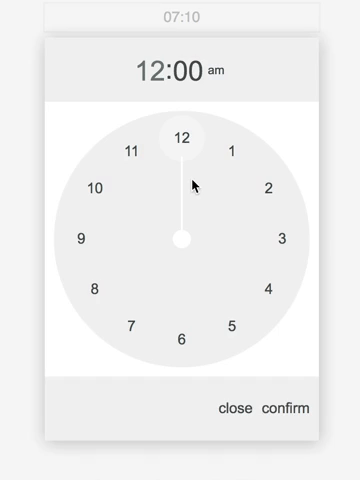
In this post I am going to share clock style time picker for Angular app, inspired by Material Design.
Install
Install via NPM
npm i ng-clock-picker-lib --save |
Add NgClockPickerLibModule to your module imports:
import { BrowserModule } from '@angular/platform-browser'; import { NgModule } from '@angular/core'; import { NgClockPickerLibModule } from 'ng-clock-picker-lib'; import { AppComponent } from './app.component'; @NgModule({ declarations: [ AppComponent, ], imports: [ BrowserModule, NgClockPickerLibModule, ReactiveFormsModule, FormsModule, ], providers: [], bootstrap: [AppComponent] }) export class AppModule { } |
With reactive forms
<form [formGroup]="form"> <input ngClockPicker [ngClockPickerConfig]="config" formControlName="time" /> </form> |
With template driven forms:
<input [(ngModel)]="time" ngClockPicker [ngClockPickerConfig]="config" /> |
With event binding:
<input ngClockPicker (ngClockPickerChange)="handleTimeChange($event)" /> |
By injecting service straight into component:
import { Component, ViewContainerRef } from '@angular/core'; import { ClockPickerDialogService, ClockPickerConfig } from 'ng-clock-picker-lib'; @Component({ selector: 'app-root', templateUrl: './app.component.html', styleUrls: ['./app.component.scss'], }) export class AppComponent { config: ClockPickerConfig = { wrapperClassName: 'className', closeOnOverlayClick: true }; constructor(private vcr: ViewContainerRef, private clockPickerDialogService: ClockPickerDialogService) {} ngOnInit(): void { this.clockPickerDialogService.registerViewContainerRef(this.vcr); } showModal(): void { this.clockPickerDialogService.showClockPickerDialog(this.config).subscribe((time: string) => console.log(time)) } } |
Config:
export interface ClockPickerConfig { wrapperClassName?: string; buttonCancel?: string; buttonConfirm?: string; closeOnOverlayClick?: boolean; initialValue?: string; is24?: boolean; } |
Styling:
Customize your clock picker styles by passing wrapperClassName to config object.
Examples:
.my-class-name .clock-picker__item-button--selected { background-color: $color-primary; color: $color-text-light; } .my-class-name .clock-picker__item-button--selected:hover { background-color: $color-primary; color: $color-text-light; } .my-class-name .clock-picker__clock-face .clock-picker__clock-face__tick { stroke: $color-primary; } .my-class-name .clock-picker__clock-face .clock-picker__clock-face__center { fill: $color-primary; } |
See live demo and download source code.
DEMO | DOWNLOAD
This awesome plugin is developed by jedrzejiwanicki. Visit their official github repository for more information and follow for future updates.