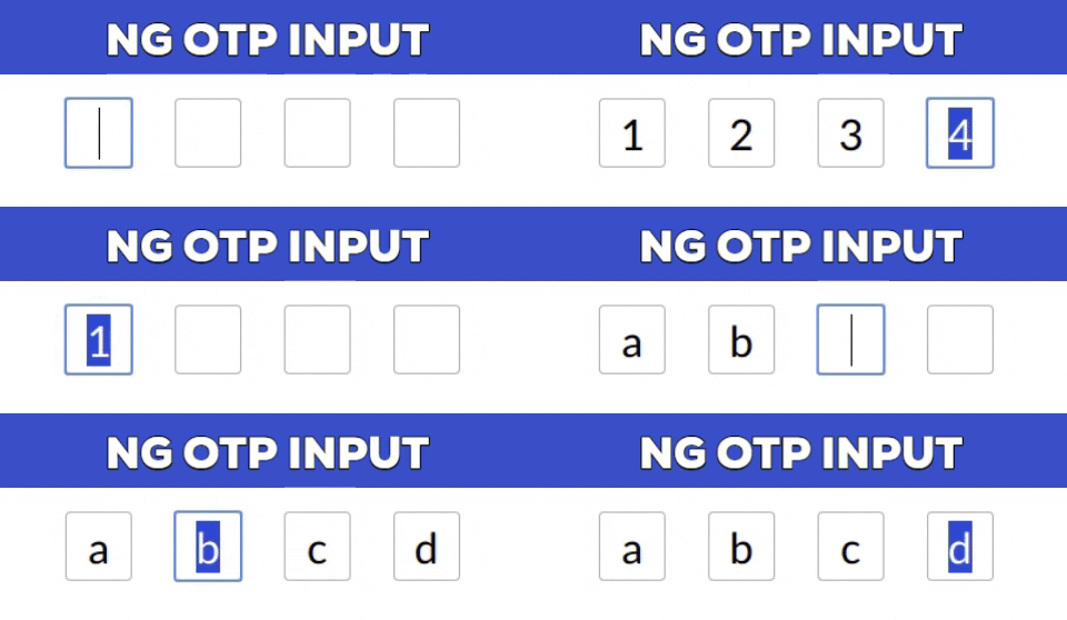
Fully customizable OTP input component in AngularJs
Are Working on OTP method on your website and looking for OTP input box sdesign as you have seen many popular website where you need to to every OTP digit in individual box. IF you are looking for same time of OTP box design then in this post I am going to share simple angular component which help you to make fully customizable, one-time password input box design.
Installation
npm install --save ng-otp-input
Usage
Add NgOtpInputModule to imports app.module.ts something like
import { BrowserModule } from  '@angular/platform-browser';
import { NgModule } from  '@angular/core';
import { AppComponent } from  './app.component';
import { NgOtpInputModule } from  'ng-otp-input';

    @NgModule({
    declarations: [AppComponent],
    imports: [ BrowserModule,
    NgOtpInputModule],
    bootstrap: [AppComponent]
    })
Add component to your page:
<ng-otp-input (onInputChange)="onOtpChange($event)" [config]="{length:5}"></ng-otp-input>
API
| Name | Type | Required | default | Description |
|---|---|---|---|---|
| config | object | true | {length:4} | various configuration options to customize the component |
| onOtpChange | function | true | — | Function that will receive the otp |
Config options
| Name | Type | Required | default | Description |
|---|---|---|---|---|
| length | number | true | 4 | Number of OTP inputs to be rendered. |
| inputStyles | object | false | — | Style applied to each input.Check [ngStyles](https://angular.io/api/common/NgStyle) for more info. |
| inputClass | string | false | — | Class applied to each input. |
| containerClass | string | false | — | Class applied to container element. |
| containerStyles | object | false | — | Style applied to container element.Check [ngStyles](https://angular.io/api/common/NgStyle) for more info. |
| allowNumbersOnly | bool | false | — | set true to allow only numbers as input | allowKeyCodes | string[] | false | — | By default numbers alphabets and _ – are allowed.Y ou can define other key codes if needed. |
| isPasswordInput | bool | false | — | set true for password type input |
| disableAutoFocus | bool | false | — | First input will be auto focused on component load enable this flag to prevent this behaviour |
See live demo and download source code.
DEMO | DOWNLOAD
This awesome script developed by code-farmz. Visit their official repository for more information and follow for future updates.
