Touch enabled selectable plugin inspired by the jQuery UI widget
Selectable allows HTML DOM elements to be selectable by way of clicking / tapping on the elements or clicking and dragging to draw a selection box. This plugin Inspired by the jQuery UI Selectable plugin. Functionality and options are identical to the jQuery UI version with some additions and performance enhancements.
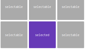
Selectable mimics the Windows file / directory behaviour, i.e. click and / or drag to select items, hold CTRL to select multiple or hold SHIFT to select consecutive groups of items.
- No dependencies.
- Lightweight – less than 5kB gzipped!
- Compatible with all modern browsers – including IE9.
- Touch enabled for use with mobile devices such as tablets and smartphones.
- Customizable.
- Fluent API.
Install
Install plugin via NPM
npm install selectable.js --save |
Libraries
Or Include the file from one of the CDNs and include it in your page:
<script src='https://unpkg.com/selectable.js@latest/selectable.min.js'></script> |
HTML
Add the CSS class ‘ui-selectable’ to the target elements.
<div id="container"> <div class="box ui-selectable"> 1 </div> <div class="box ui-selectable"> 2 </div> <div class="box ui-selectable"> 3 </div> <div class="box ui-selectable"> 4 </div> <div class="box ui-selectable"> 5 </div> <div class="box ui-selectable"> 6 </div> <div class="box ui-selectable"> 7 </div> <div class="box ui-selectable"> 8 </div> ... </div> |
JS
Initialize the Selectable plugin and done.
var selectable = new Selectable({ toggle: false, // auto refresh autoRefresh: true, // the minimum interval in milliseconds to wait before another resize or scroll callback is invoked. // higher numbers will increase scroll performance, but can delay item highlighting when auto scrolling. throttle: 50, // parent container appendTo: document.body, // CSS selector filter: ".ui-selectable", // how far the lasso overlaps a selectable element before it's highlighted for selection. // "touch" or "fit" tolerance: "touch", // the direction for selecting consecutive groups of items when holding SHIFT. shiftDirection: "normal", // auto scroll when selecting autoScroll: { offset: 40, increment: 10, }, // sets default ignore items ignore: false, // style the lasso. Must be an object of valid CSS properties and values. lasso: { border: '1px dotted #000', backgroundColor: 'rgba(52, 152, 219, 0.2)', }, // default CSS classes classes: { lasso: "ui-lasso", multiple: "ui-multiple", selected: "ui-selected", container: "ui-container", selecting: "ui-selecting", selectable: "ui-selectable", unselecting: "ui-unselecting" } }); |
See live demo and download source code.
DEMO | DOWNLOAD
This awesome plugin is developed by Mobius1. Visit their official github repository for more information and follow for future updates.